12.6. Layout Panes
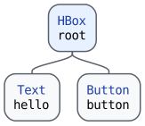
The HBox object at the root of ExampleApp's scene graph is an
example of a layout pane. A layout pane is a container node that
automatically positions (and sometimes resizes) its children. The
JavaFX layout panes are in the
javafx.scene.layout package,
and you can find links to commonly used ones in the "RE: Layout Panes"
section of the JavaFX Bookmarks and Notes page. Let's change how root lays
out the Text and Button objects that you added to ExampleApp
in the previous section.
After the previous section, the scene graph for ExampleApp looks
like this:
Fig. 12.5 Scene Graph: ExampleApp with a Button [svg] [png]
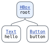
The mockups below show the app after a fresh launch, before the button is clicked. The macOS frames are illustrative; fonts and window decorations may vary by system. The last two mockups use an enlarged window to make the alignment easier to see.
Compile
ExampleApp.java, then rerunExampleDriver. Look closely at the app. The text and the button are right next to each other, and they touch the edges of the window. Also notice that the top of the text lines up with the top of the button.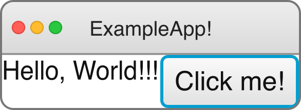
Fig. 12.6 Notice the lack of space between the text and the button or around the row.
An
HBoxplaces its children in a single horizontal row. By default, it does not put any space between its children. Add the following line immediately after the line that creates theHBoxobject in the constructor:this.root.setSpacing(10);
This sets the amount of horizontal space (in pixels) that
rootleaves between each of its children. CompileExampleApp.java, then rerunExampleDriver. You should see a gap between the text and the button.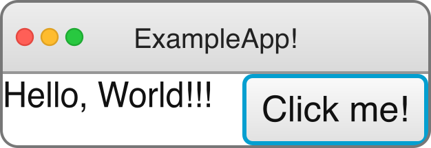
Fig. 12.7 A gap of 10 pixels separates the text and the button.
The spacing does not add any space between the children and the edges of the
HBox. That space is called padding. Import the javafx.graphics/javafx.geometry.Insets class, then add the following line immediately after the line you added in the previous step:this.root.setPadding(new Insets(10));
An
Insetsobject describes a set of inside offsets for the 4 sides of a rectangular area. The constructor that we used gives all 4 sides the same offset. There is also a constructor that lets you specify the top, right, bottom, and left offsets separately. CompileExampleApp.java, then rerunExampleDriver. You should now see space between the edges of the window and the nodes inside of it.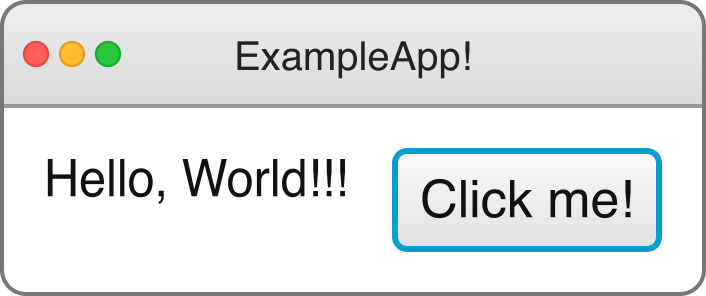
Fig. 12.8 Padding adds 10 pixels of space around the row while keeping the gap between the children.
The alignment of an
HBoxdetermines where its children are placed inside of it. The default alignment isPos.TOP_LEFT, which is why the top of the text lines up with the top of the button. Import the javafx.graphics/javafx.geometry.Pos enum, then add the following line immediately after the line you added in the previous step:this.root.setAlignment(Pos.CENTER);
Compile
ExampleApp.java, then rerunExampleDriver. The text should now be vertically centered next to the button. Make the window larger by dragging one of its corners. The text and the button should stay together in the center of the window.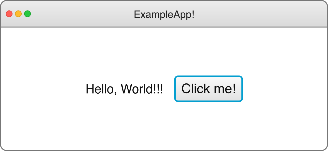
Fig. 12.9 After enlarging the window, notice how the row stays centered.
Let's see what happens if we use a different layout pane. Import the javafx.graphics/javafx.scene.layout.VBox class, then change the declared type of the
rootinstance variable:private VBox root;
In the constructor, change the assignment to
rootso that it creates aVBoxobject instead:this.root = new VBox();
A
VBoxplaces its children in a single vertical column. It also hassetSpacing,setPadding, andsetAlignmentmethods, so the lines you added in the previous steps still compile. CompileExampleApp.java, then rerunExampleDriver. You should see the button below the text. The spacing is now vertical instead of horizontal. Make the window larger if needed to compare the centered column with the centered row in the previous step.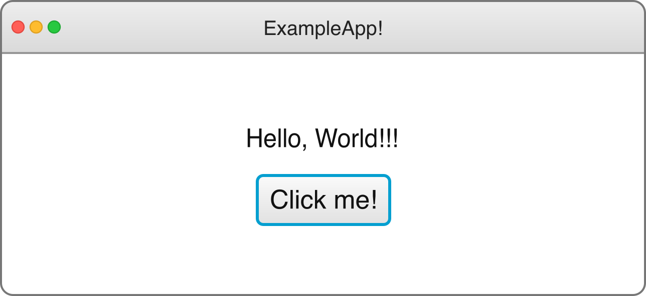
Fig. 12.10 The children now form a centered column. The spacing and padding are still 10 pixels.
Change the declared type of
rootback toHBoxand change the constructor assignment back tothis.root = new HBox();before you continue. Remember to compileExampleApp.javaand rerunExampleDriverto make sure that your app looks the way it did at the end of the step where you set the alignment.
Example: Letting a Child Grow with HBox.setHgrow
If you make the ExampleApp window wider, neither the text nor
the button gets wider. A Text object is not resizable, and by
default, the maximum width of a Button object is its preferred
width. Some nodes, like a
javafx.controls/javafx.scene.control.TextField,
can grow. If an HBox is wider than its children need, then you
can tell it to give the extra horizontal space to a particular child
by calling the static HBox.setHgrow method:
TextField urlField = new TextField("https://");
Button loadButton = new Button("Load");
HBox urlBar = new HBox(10, urlField, loadButton);
HBox.setHgrow(urlField, Priority.ALWAYS);
Here, the HBox constructor sets the spacing to 10 and adds
both children. When urlBar is wider than its children need, the
TextField grows to fill the extra space, and the Button
stays the same width. The VBox class has a similar static
setVgrow method.
Imports
javafx.scene.control.Buttonjavafx.scene.control.TextFieldjavafx.scene.layout.HBoxjavafx.scene.layout.Priority